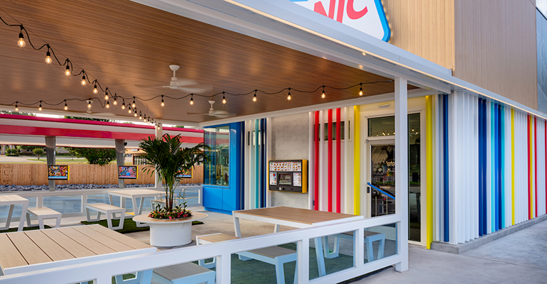
Sonic unveils new drive-in design as part of brand makeover
From NRN Jul2020 – Sonic Drive-In’s new drive-in area has brighter colors, wider car docks, and a covered patio with lawn games
Excerpt:
Sonic Drive-In has unveiled a new drive-in design with an updated, wider layout for car docks and the drive-thru lane, a new kitchen layout built for efficiency, and an aesthetic makeover. Dubbing their new drive-thru look “Delight,” the summertime aesthetic, red and blue color palette, and new neon cherry sign on each newly designed Sonic Drive-In (a nod to the brand’s iconic cherry limeade), are the latest steps in a brand refresh encouraged by the chain’s parent company, Inspire Brands, which has owned Sonic since the end of 2018.
“Last year we focused our attention on memorializing who we were as a brand and who our consumer is,” Sonic president Claudia San Pedro said. “Our purpose is to be the little oasis in everyone’s daily routine[…] We wanted to physically showcase how summertime is a feeling and a mindset in the classic drive-in experience […] and we were able to achieve that with bright colors, mood, and a mid-century airy feel.”
Related: Sonic Drive-In now allows customers to find locations and menu items with new Amazon Alexa skill
Contact Joanna Fantozzi at Joanna.fantozzi@informa.com
Follow her on Twitter: @joannafantozzi

